Home /
Expert Answers /
Economics /
the-following-graph-shows-three-total-expenditure-lines-for-an-economy-at-three-different-price-lev-pa966
(Solved): The following graph shows three total expenditure lines for an economy at three different price lev ...
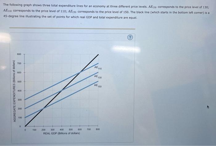
The following graph shows three total expenditure lines for an economy at three different price levels. AE30 corresponds to the price level of 130; AE110 corresponds to the price level of 110; AE so corresponds to the price level of 150. The black line (which starts in the bottom left corner) is a 45-degree line illustrating the set of points for which real GDP and total expenditure are equal. 300 700 AE, -110 500 AE 130 500 AE, AGGREGATE EXPENDITURES (Billions of dollars) 400 300 200 100 0 D 100 700 600 200 300 400 500 600 REAL GDP (Billions of dollars)
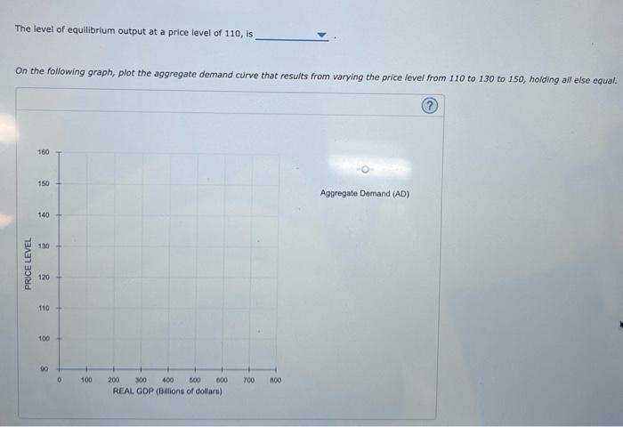
The level of equilibrium output at a price level of 110, is On the following graph, plot the aggregate demand curve that results from varying the price level from 110 to 130 to 150, holding all else equal. 160 150 Aggregate Demand (AD) 140 130 PRICE LEVEL 120 110 100 90 0 100 700 100 200 300 400 500 000 REAL GDP (Billions of dollars)