Home /
Expert Answers /
Statistics and Probability /
the-scatter-chart-in-the-following-figure-was-created-using-sample-data-for-profits-and-market-cap-pa878
(Solved): The scatter chart in the following figure was created using sample data for profits and market cap ...
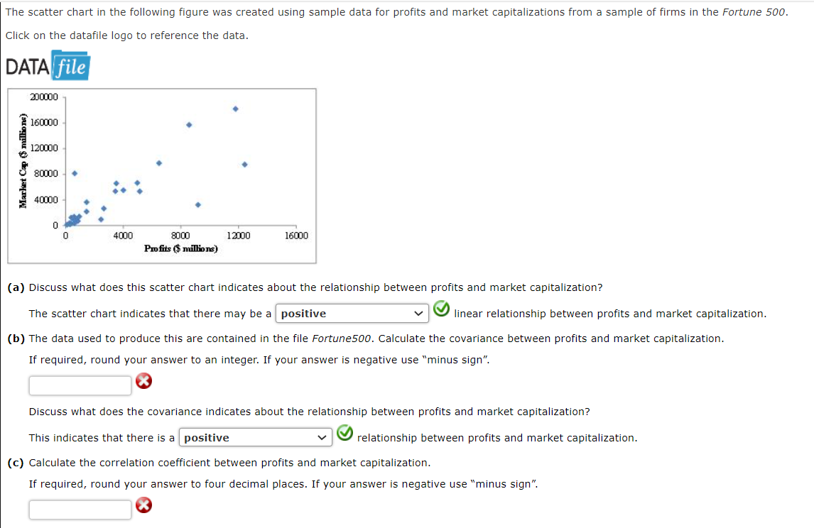
The scatter chart in the following figure was created using sample data for profits and market capitalizations from a sample of firms in the Fortune 500 . Click on the datafile logo to reference the data. DATA file (a) Discuss what does this scatter chart indicates about the relationship between profits and market capitalization? The scatter chart indicates that there may be a linear relationship between profits and market capitalization. (b) The data used to produce this are contained in the file Fortune500. Calculate the covariance between profits and market capitalization. If required, round your answer to an integer. If your answer is negative use "minus sign". (3) Discuss what does the covariance indicates about the relationship between profits and market capitalization? This indicates that there is a relationship between profits and market capitalization. (c) Calculate the correlation coefficient between profits and market capitalization. If required, round your answer to four decimal places. If your answer is negative use "minus sign".